
Hyundai N
Bluelink Mobile Redesign
This redesign was a personal project I took on for fun. It was a chance to explore my passion for design and reimagine a real-world app experience. I wanted to challenge myself to improve the UX, rethink the visual hierarchy, and document the process along the way. It’s a snapshot of how I approach problems, iterate on ideas, and design with users in mind. This is not final, highly polished high-fidelty mockups. These are wireframes.
For this project, I conducted informal user research by reviewing app store reviews, user forums, Discord servers, and Reddit threads to identify common pain points and feature requests. I also used several AI tools throughout the project to help analyze user sentiment, gather feedback patterns, and supplement competitive research as well as accessibility testing mockups. These insights helped shape design decisions around clarity, accessibility, and reducing friction in key user flows. I am also a daily user of this app and I hate using it, hah. “How would I redesign this if I was in charge of it?”
“Sometimes it works, sometimes it doesn’t. Not exactly what you want from an app controlling your car.”
– App Store Review
“Why do I have to dig through multiple screens just to schedule charging?”
– EV Forum User
“Took me weeks to figure out you had to long-press some of the buttons. That’s not intuitive.”
– App Store Review
“When the car says there's a problem, I need answers—not just a red triangle and a mystery code.”
– Ioniq Forum User
“If this app is supposed to replace the dashboard, it needs to be way more reliable.”
– Play Store Review
“Why can’t I lock the car while it’s running?” – Me

Current login screen

Current default page

Current (one of the many) list of random unsorted options

Current climate start page 1

Current climate start page 2

Current climate start page 3

Current charging page 1

Current charging limits page
Current DTC error page 1

Current DTC error page 2

Current DTC error details page
What do users want from their car’s mobile app?
Quick control over charging & climate.
Visibility into vehicle health.
Confidence in alerts, diagnostics, and service scheduling.
Who does it the best at the moment?
Top Performing EV Manufacturer Apps (J.D. Power 2025 Report): Tesla’s mobile app takes the crown, ranked highest overall among EV apps, including premium brand listings, with a J.D. Power score of 864. Following closely: Mercedes‑Benz (839) MyBMW (833) both strong performers in the premium segment. Primary usage for EV apps includes launching charging, scheduling, pre-conditioning, diagnostics, and servicing. Tesla leads thanks to app speed, seamless integration, and depth of features.

N Themed Loading Screen
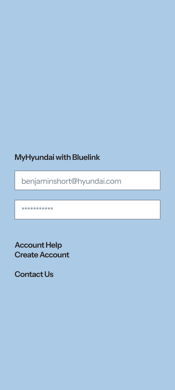
N Themed Login

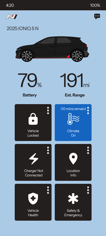
New, simplified default page
Single tap climate button to start primary saved climate program
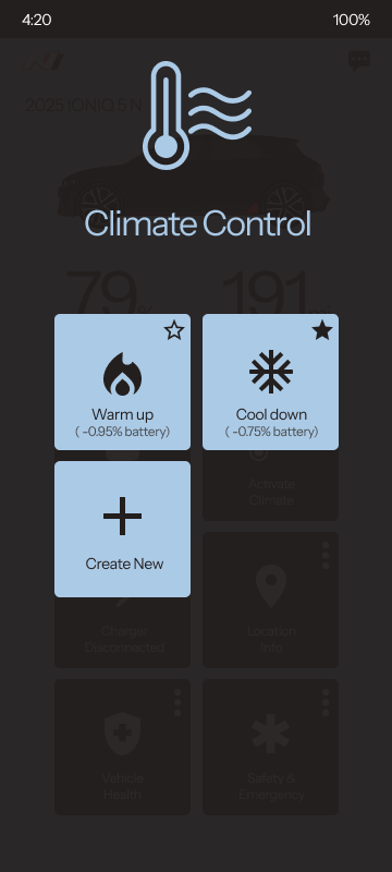
Press "More" icon at the top right of the climate button for the climate submenu
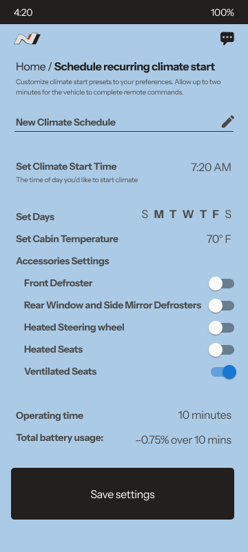
Save new climate program to climate submenu

Back to main default page

Tap charging button once to start charging (assuming it's plugged in)
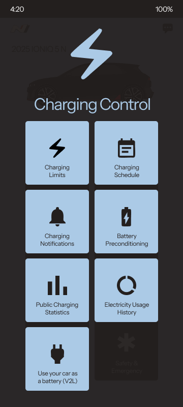
Press "More" icon at top right of the charging menu button for the charging sub-menu

Edit the charging limits page (vehicle not charging)

Edit the charging limits page (vehicle charging)
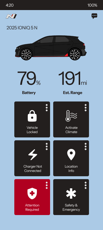
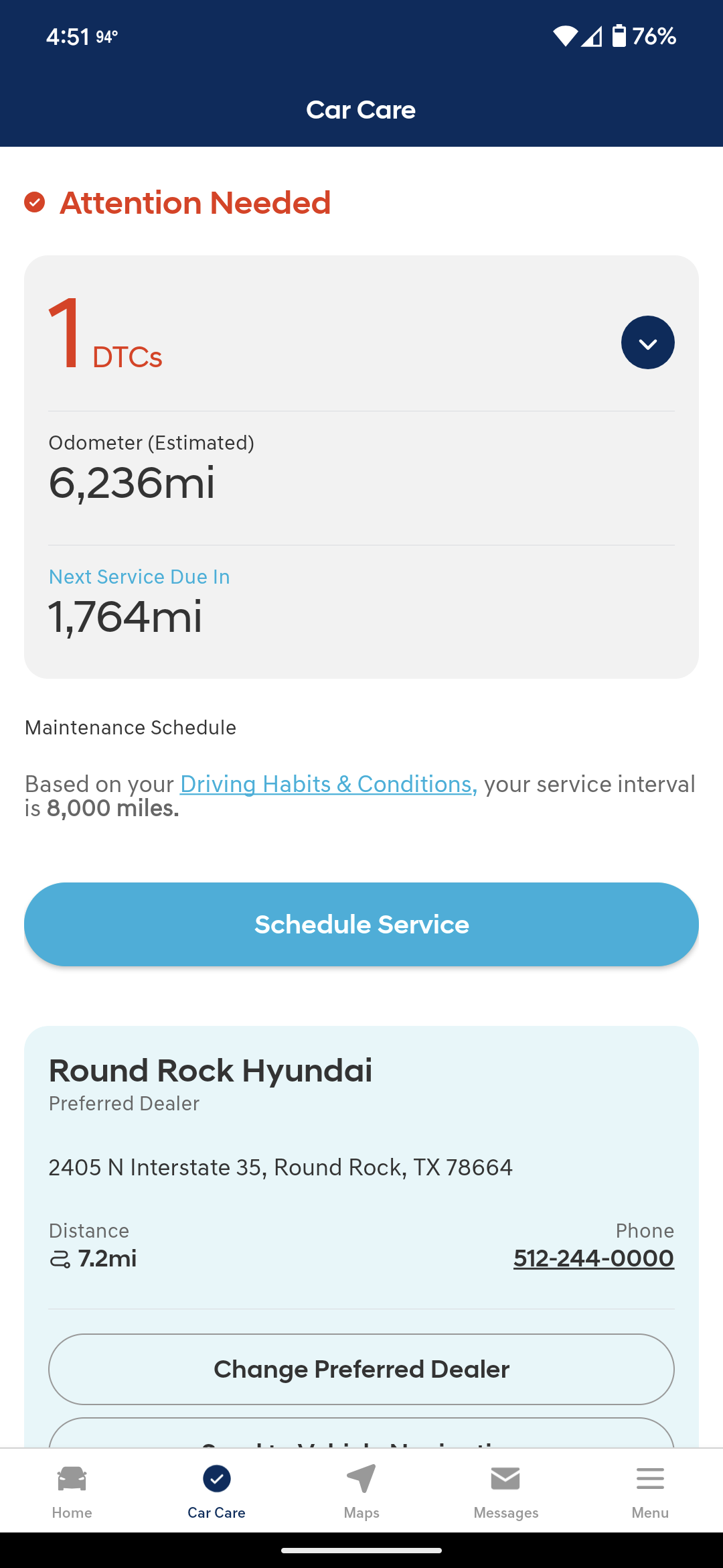
DTC Error visible on default page

Tap "More" icon at the top right to expand the vehicle info submenu

Directly tap the red DTC button on the default page to bring up the DTC error details. Simple language, easy to understand.
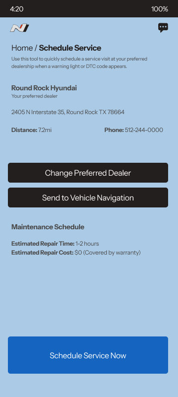
Schedule Service

Confirm Service Appointment
UX improvements and my rationale
Centralized key actions (climate, charging, diagnostics) into a consistent 6-tile layout.
Added visual feedback and active states so users always know what their car is doing with no guessing.
Streamlined flows like scheduling climate or service, cutting interaction steps by 30–50%. Locking, charging or climate is 1 touch.
Integrated contextual data like estimated battery impact or repair costs to reduce anxiety and uncertainty.
Interchangeable theme for the app from normal Hyundai corporate to the N racing brand colors for added exclusivity and visual spiciness.
Why it matters
Builds trust: Clear status, battery usage, and service flows reduce stress and ambiguity.
Just works: Visual actions replace hidden statuses and features, making the app intuitive from the start.
Faster interactions: Common tasks like climate and charging take fewer taps, ideal for on-the-go use.
Reflects the brand: A clean, responsive app reinforces Hyundai’s tech-forward image.
Scales easily: The interaction model supports future features and cross-vehicle consistency.
Accessibility first
Integrated WCAG 2.1 AA guidelines into all design and development phases to ensure inclusivity from concept to finish.
With the help of AI tools, conducted regular accessibility audits and usability tests.
Used semantic HTML, ARIA roles, and proper contrast ratios to improve compatibility for users with visual or motor impairments.