Foresite Cybersecurity - 2026

Future-State Vision & “Trust-First” AI Integration
AI-Assisted Rapid Prototyping & Design
During my time as UX Design Principal at Foresite Cybersecurity, I planned out the long-term UX vision for the Catalyst platform and governed the evolution of our enterprise design system. My core focus was translating complex security requirements into intuitive, accessible solutions, highlighted by designing an AI Triage agent that reduced SOC analyst response times and improve efficiency. I also helped cultivate a mature, design-led culture by standardizing our UX research frameworks and serving as a strategic advisor to our engineering and product teams.
I leveraged Google AI Studio and Claude to rapidly translate UX audit findings and product requirements into a cohesive, high-fidelity prototype. This future-state vision resolved immediate usability friction while shifting the platform from a reactive, isolated chatbot model to a proactive, passive AI assistant that I embedded directly into the analyst workflow.
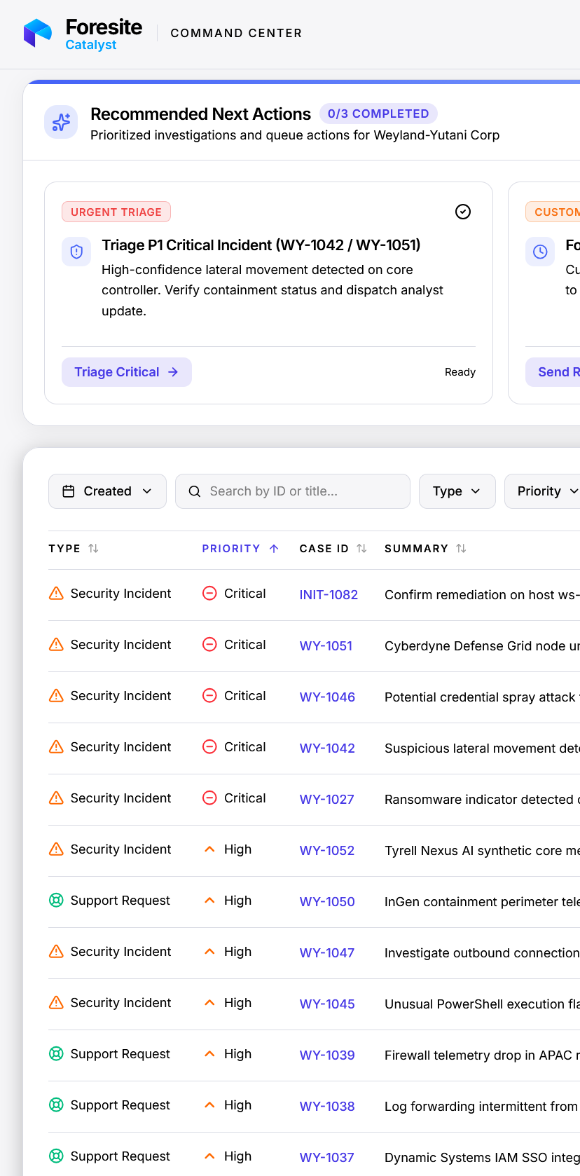
Prompt-to-Prototype Workflow: I utilized Claude and Google AI Studio to quickly generate and iterate on interactive UI layouts, turning static UX audit recommendations into testable design concepts that unified the platform's visual language.
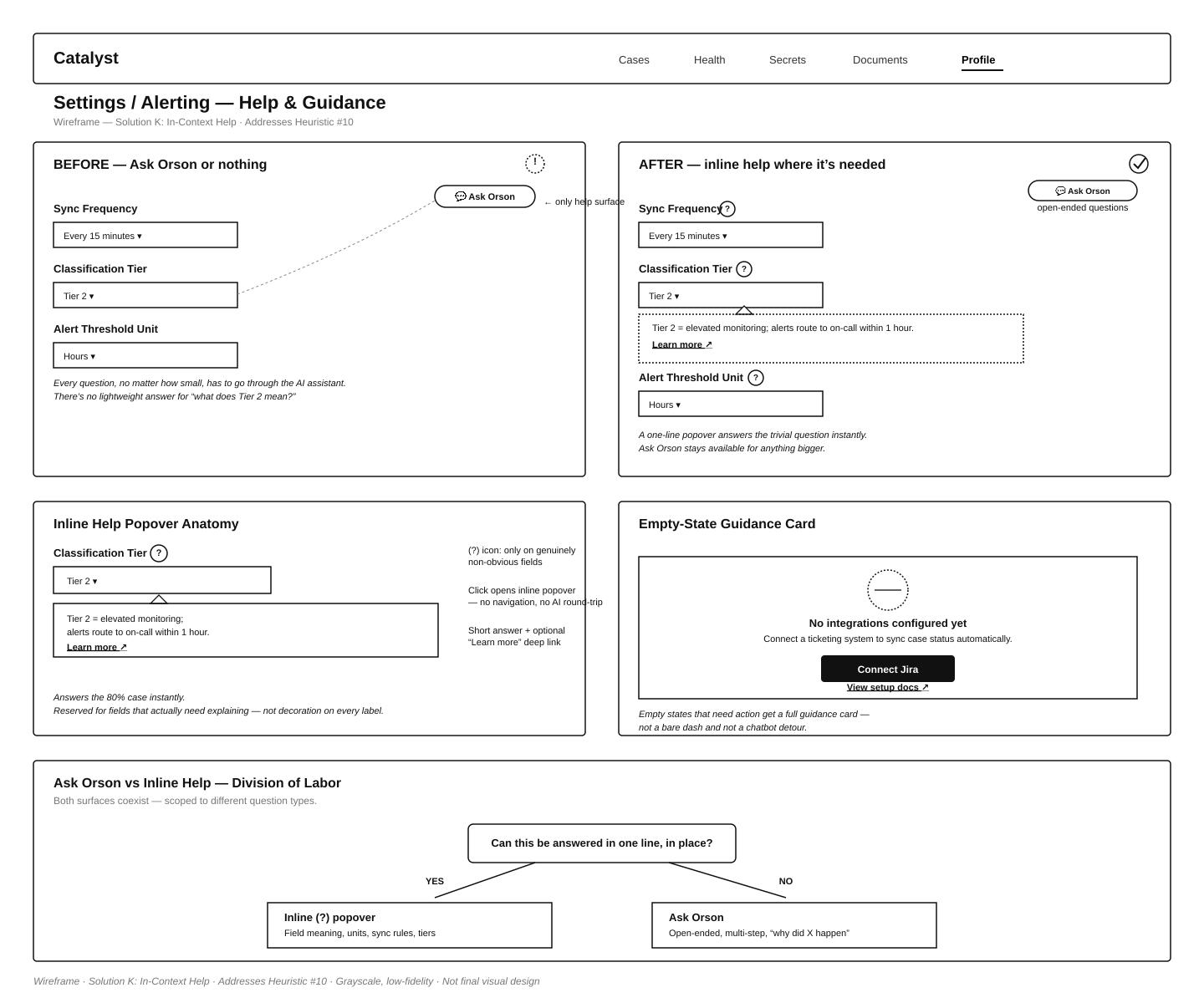
Passive AI & Value-Driven Microcopy: I transitioned AI interactions away from the siloed "Ask Orson" chatbot, weaving insights directly into the dashboard and case views. I incorporated subtle feedback loops—such as "We saved you 15 minutes here"—to continually quantify the AI's operational value and build user confidence.
Human-in-the-Loop (HITL) Validation: I designed explicit "intervention gates" where AI performs data correlation and drafts "next-best-action" recommendations, but requires a deliberate human approval click before finalizing any automated triage decisions or high-stakes actions.
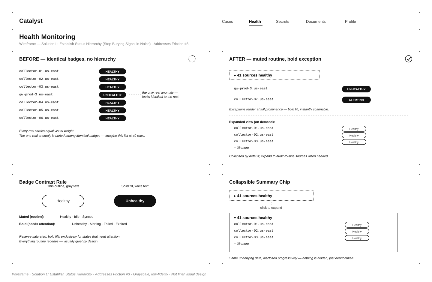
Prioritizing Signal Over Noise: I restructured the dashboard to guarantee Priority 1 and critical incidents remain front and center. I applied a "muted routine, bold exception" visual framework to suppress healthy statuses and draw immediate focus to anomalies.
Proactive Operational Dashboards: I modeled a redesigned Home dashboard replacing decorative elements with dynamic, content-driven summaries of live onboarding progress, SLA compliance, and ingestion forecasts.
Triage Agent Sidecar UI: I designed the interface for the post-MVP AI Triage Agent sidecar deployment, prototyping dedicated panels that surface expanded investigation data, automated event timelines, and a continuous analyst feedback mechanism.
You can view the prototype below. Controls at the top allow for changing various aspects of the interface. I would be happy to show you through it as well!
Note: it was not completed and a few links don’t work and some pages (IE: Service Performance) didn’t have PRD’s written yet. This was a proof of concept prototype.
Catalyst UX Audit & Remediation Plan
Catalyst is Foresite's cloud-native SecOps platform that gives analysts a centralized workspace to triage cases, manage IOC hunts, monitor collection agent health, and handle documents across customer environments. This comprehensive UX audit and remediation plan evaluated data density, color contrast ratios, and minimalist widget designs to transform a complex system into a transparent and predictable tool for security analysts.
Heuristics & Analytics Evaluation: Conducted an in-depth heuristic analysis of usability friction points, and utilized FullStory product analytics to uncover dead-click rates and navigation hotspots.
Accessibility & Contrast Compliance: Audited interface elements like status tags and disabled input fields to improve data density and color contrast, ensuring compliance with WCAG 2.1 AA accessibility guidelines by enforcing minimum 4.5:1 contrast ratios.
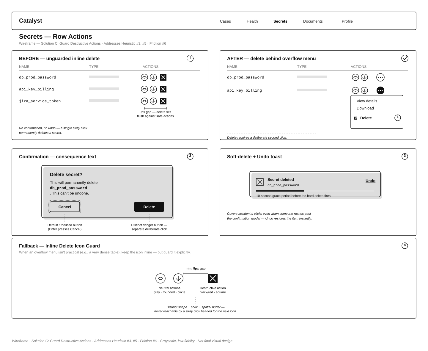
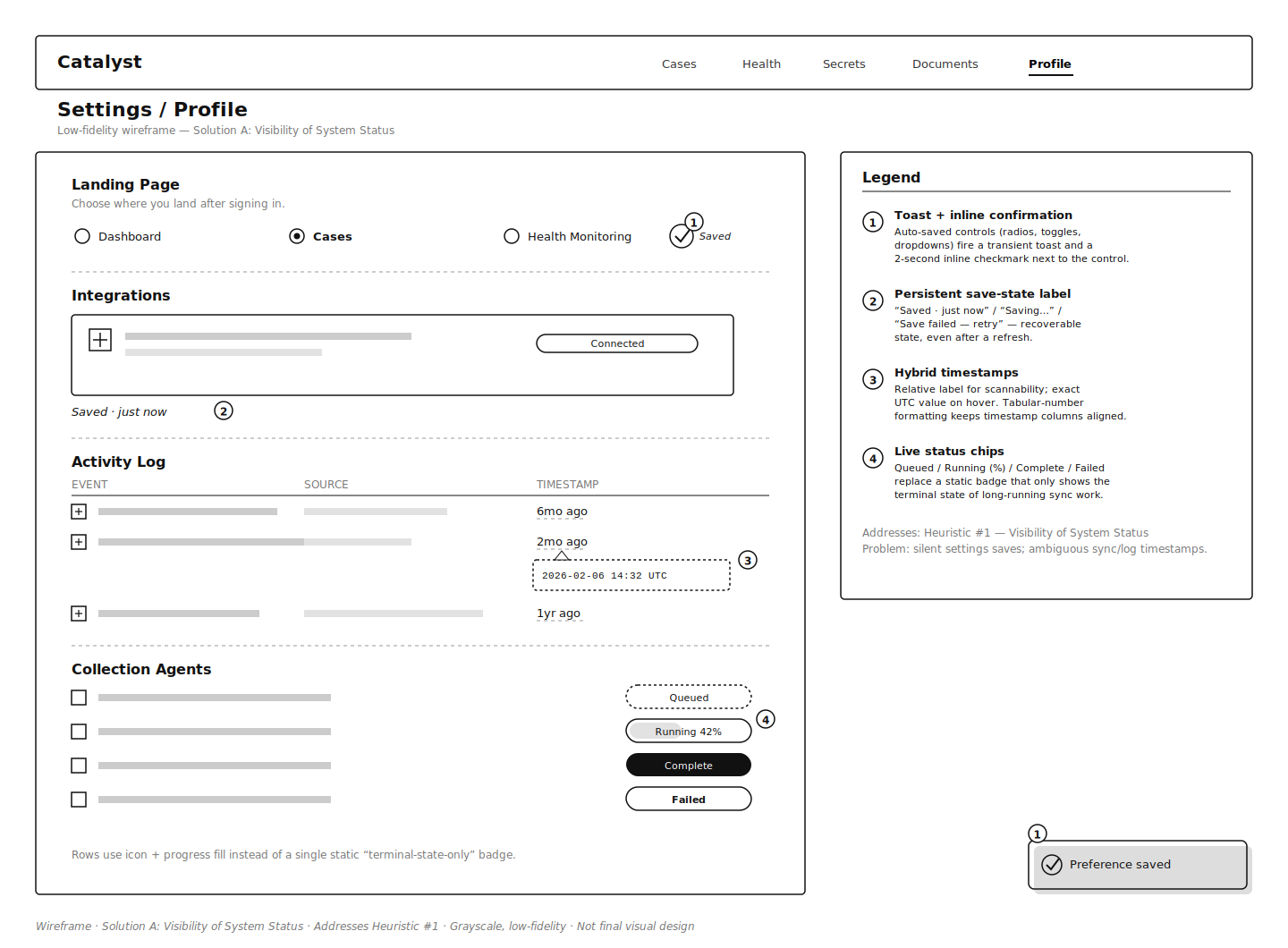
Guarding Destructive Actions: Addressed unguarded delete functions by isolating high-risk actions into contextual overflow menus, and enforced predictable undo paths with soft-delete toasts to prevent accidental data loss.
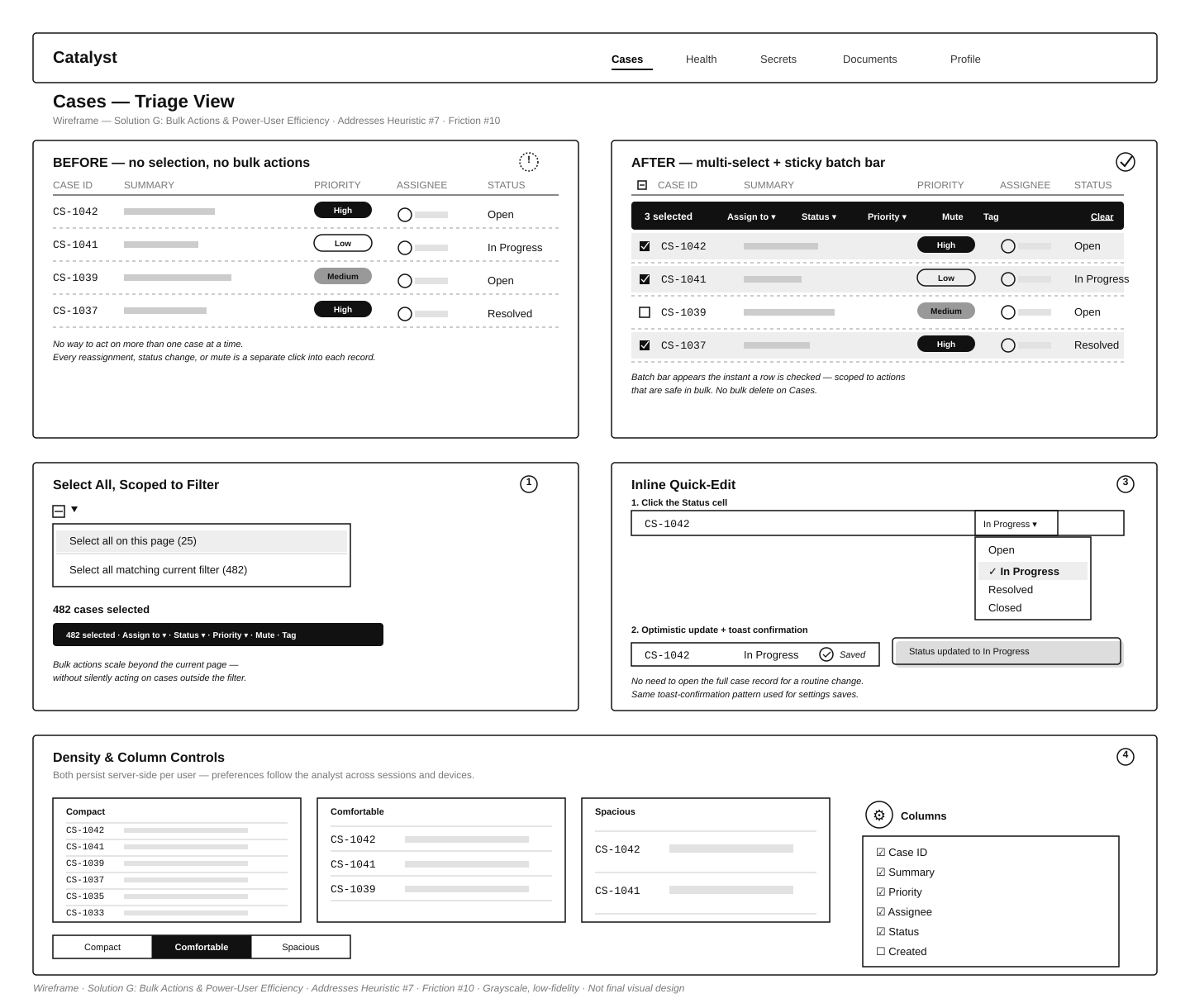
Bulk Actions & Power-User Efficiency: Overhauled high-volume triage workflows by designing multi-select checkboxes and sticky batch action bars, and introduced inline quick-edits to accelerate repetitive tasks.
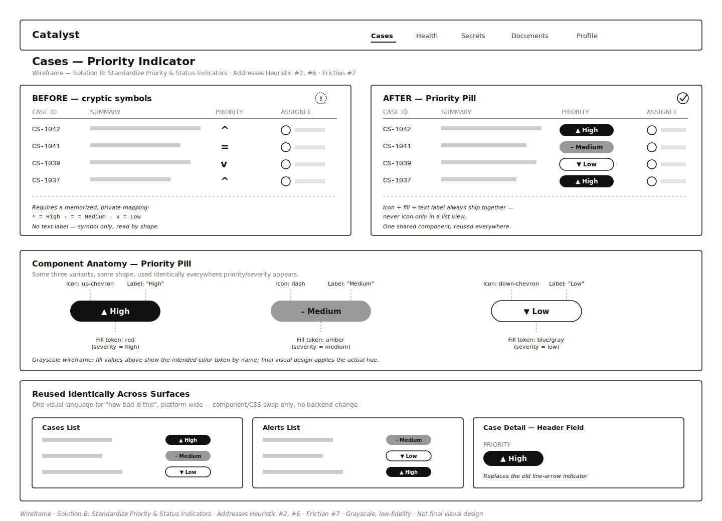
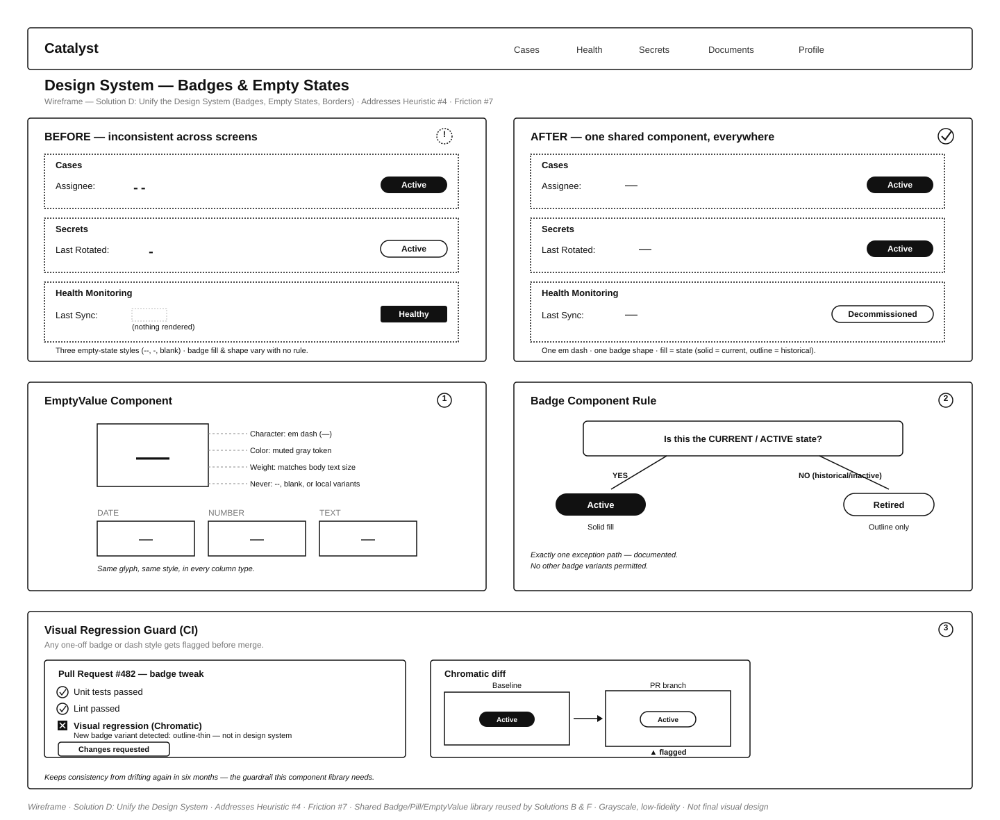
Standardizing Priority Indicators: Replaced cryptic mathematical symbols and varied border styles, establishing a unified design system of solid-fill priority pills and explicit, human-readable labels.
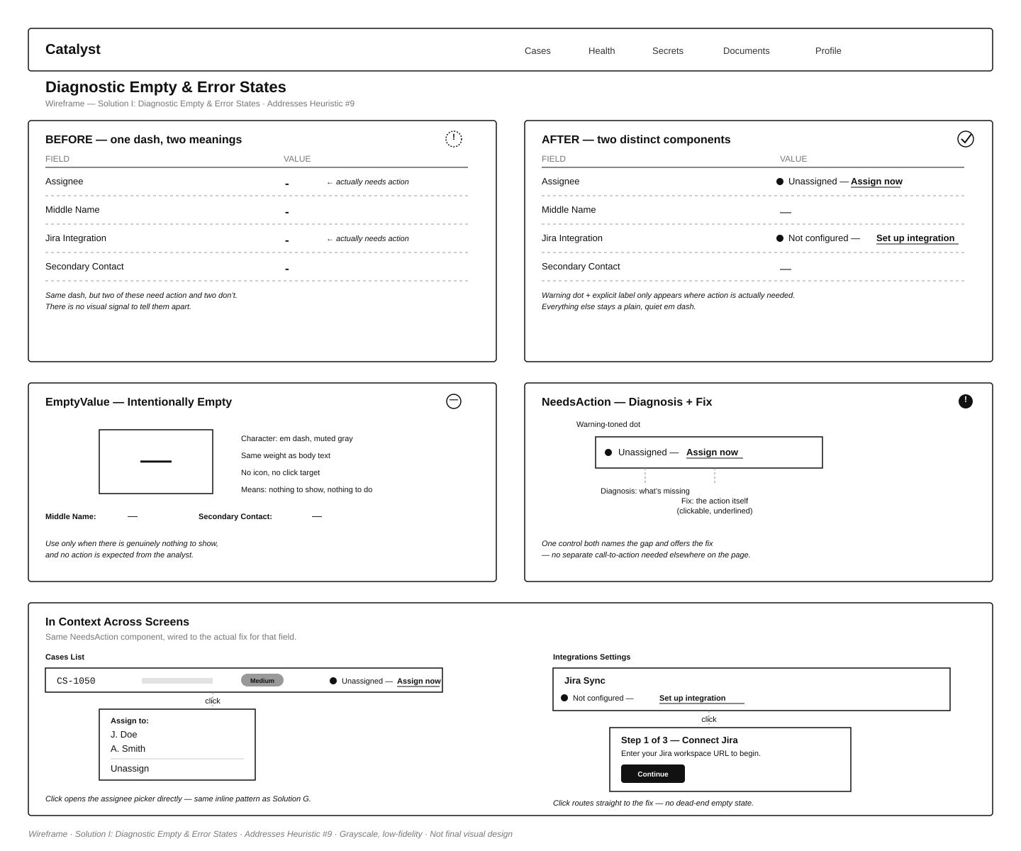
Diagnostic Empty & Error States: Replaced ambiguous, unpopulated table dashes with explicit diagnostic alerts, such as clickable "Assign now" indicators, to guide users seamlessly toward issue recovery.
Eliminated risk-bearing UX gaps to prevent missed security detections and accidental data loss.
Reduced triage time in high-volume case views by introducing bulk actions, inline edits, and configurable UI density.
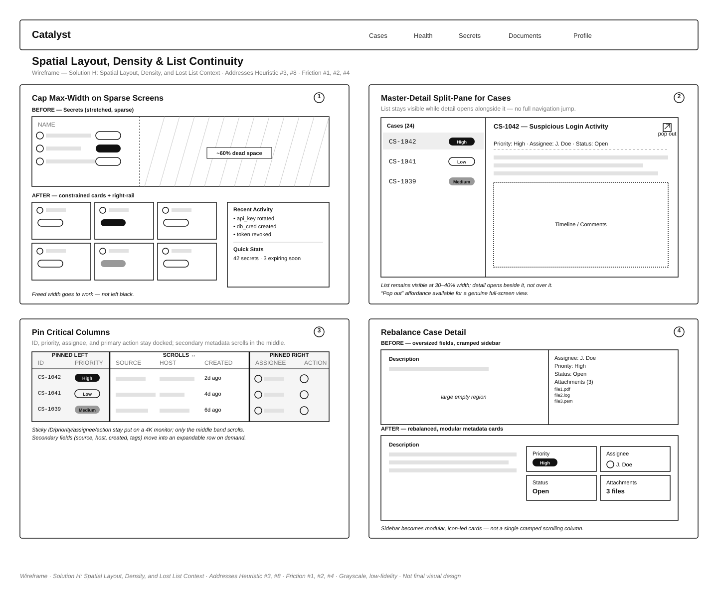
Addressed high-friction interaction points, including a 13.6% dead-click rate on Case Details, by refining table affordances and layout distribution.
Design System Updates and Expansion
(More content coming soon)
I unified the Catalyst design system, resolving systemic UI inconsistencies and establishing a coherent visual language across the platform.
Standardizing Priority & Status Components: I replaced cryptic mathematical symbols and randomly mixed outline styles with a unified Priority Pill component, utilizing solid color fills, clear icons, and explicit human-readable text labels. I established strict, documented rules for badge styling to ensure a single visual language platform-wide.
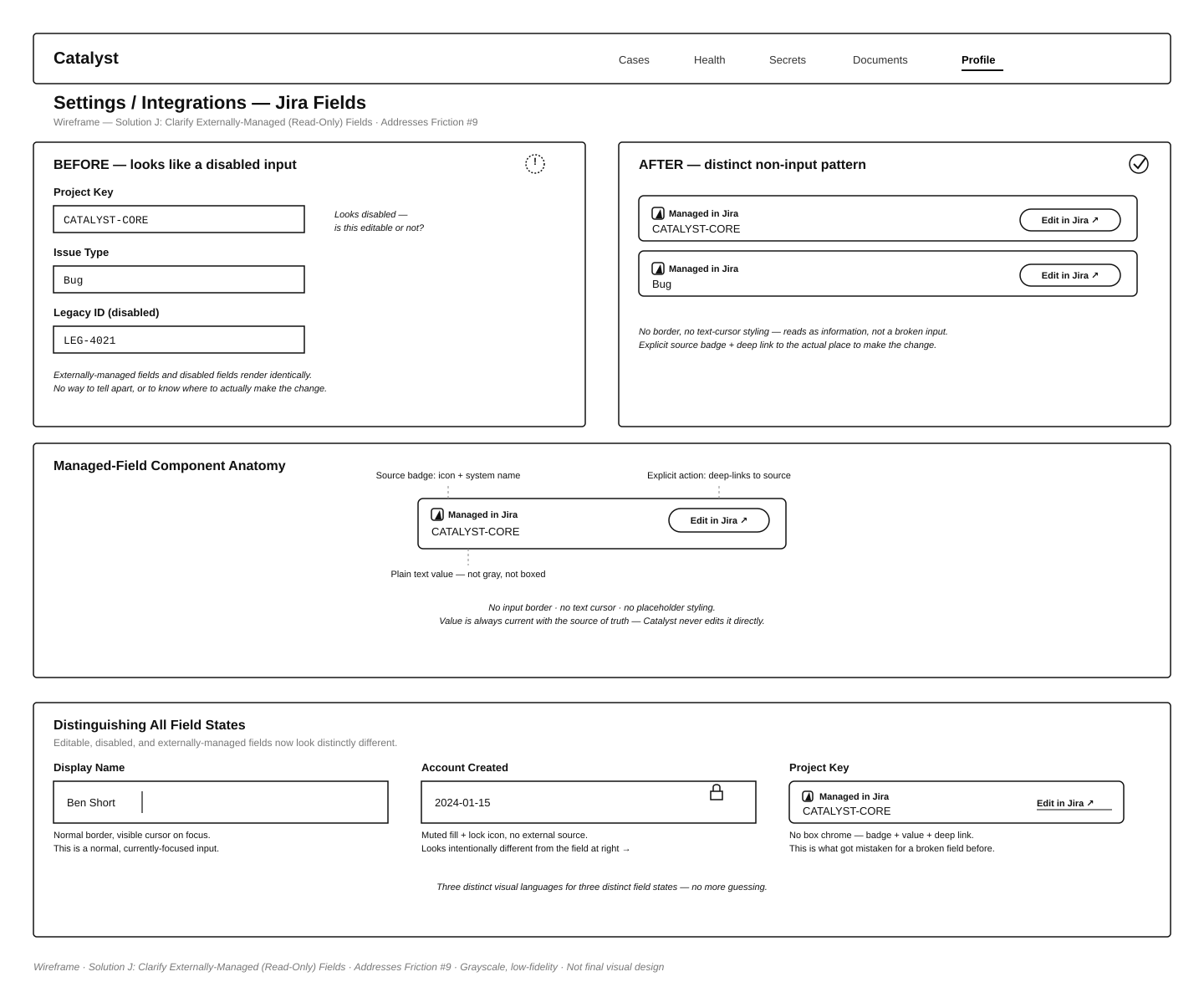
Normalizing Empty & Read-Only States: I designed a universal EmptyValue component—a standardized, muted em-dash—to replace the chaotic mix of double dashes and blank spaces previously used across tables. I also redesigned externally managed Jira fields, removing the text-box chrome so they read as distinct information cards rather than broken or disabled inputs.
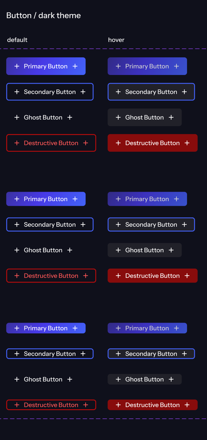
Color Architecture & Component Refining: Acting on internal feedback regarding poor dark mode contrast and clunky elements, I defined a structured three-layer background color scheme to improve UI depth. I also initiated a redesign of the core button components to replace overly tall, boxy outline buttons with cleaner ghost and primary styles.
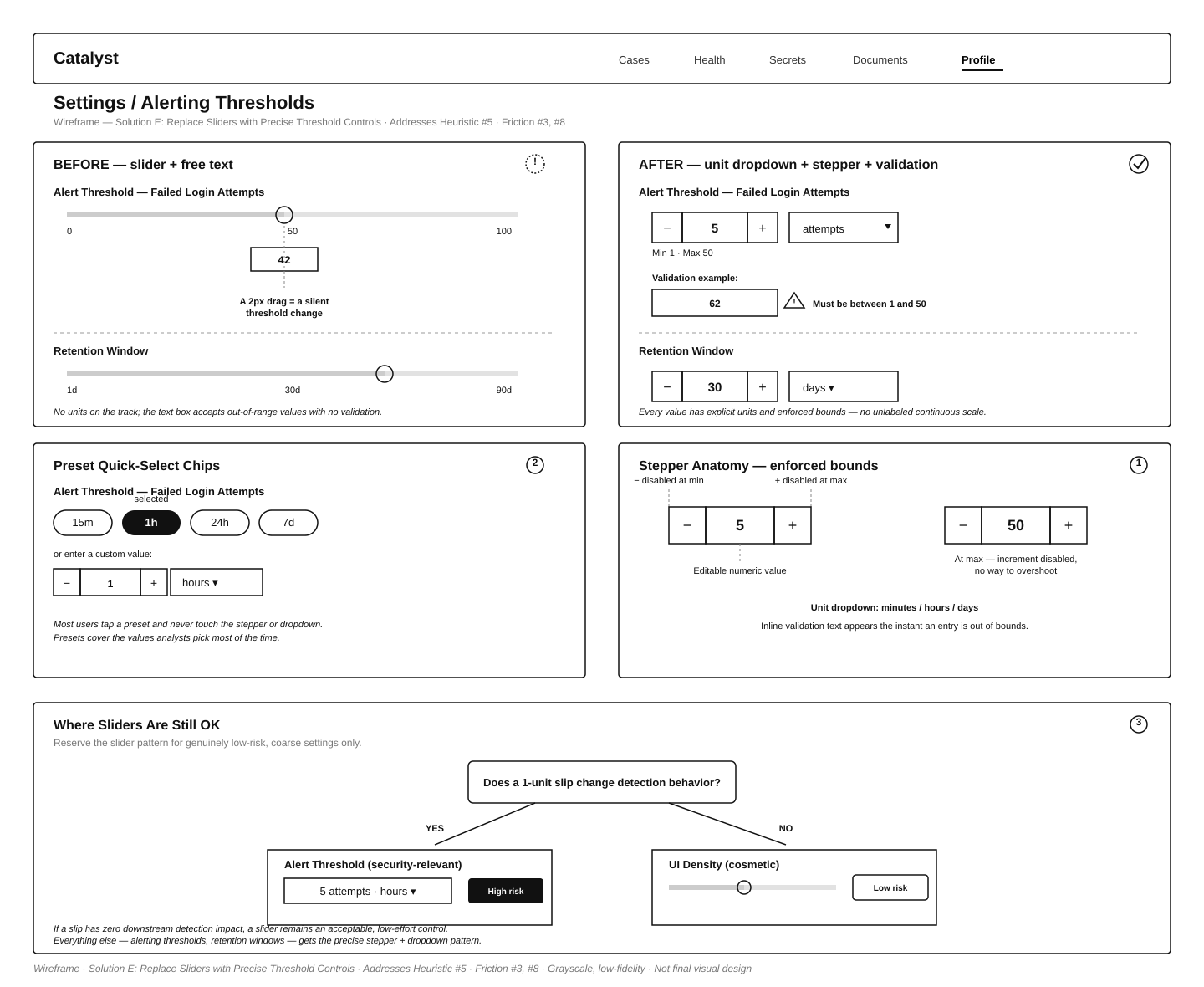
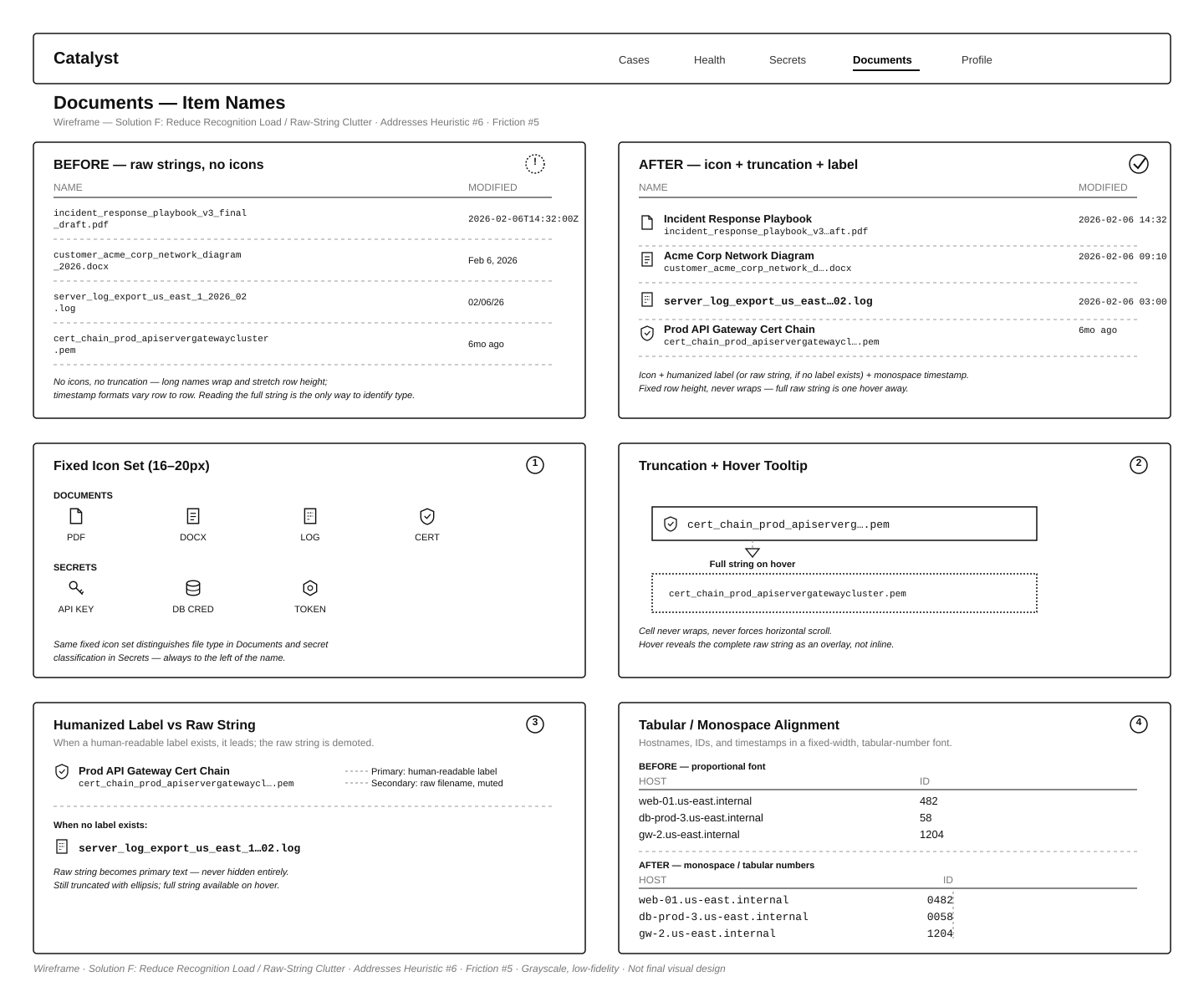
Precision Input Controls & Typography: I replaced error-prone continuous sliders with precise time-picker dropdowns and numeric steppers, complete with inline validation, to prevent silent misconfigurations on security-critical threshold settings. I also implemented tabular, monospace formatting and humanized labels for raw technical strings to improve table scannability.
Visual Regression Guardrails: To protect the integrity of the design system over time, I recommended integrating visual-regression checks (such as Storybook combined with Chromatic or Percy) into the CI pipeline. This ensures that pull requests reintroducing one-off badge variants or rogue dash styles are flagged before merging.
I consolidated fragmented UI elements into a single shared component library, eliminating design debt and guaranteeing visual consistency across all views.
I improved dark mode accessibility and visual hierarchy by establishing a structured three-layer background scheme and refining component contrast.
I mitigated the risk of accidental security misconfigurations by designing out imprecise slider inputs in favor of exact, validated numeric controls.